Each graph includes 4 or 5 activities designed to build graph reading and data analysis skills.
👉 Share feedback or suggest a graph: Google Form
How to Use This Collection
Suggested Use: We recommend completing the activities in order to build students’ understanding and confidence in reading and interpreting graphs.
- Gradual Graph Reveal- The graph is revealed step by step for teacher-led discussion. Students observe the data, make predictions, and discuss what the graph might show before seeing the complete graph.
- Basic Graph Reading- Students answer multiple-choice questions that focus on reading values and identifying information directly from the graph. Auto-graded.
- Interpreting Patterns- Students answer multiple-choice questions that focus on identifying patterns, trends, and relationships in the data. Auto-graded.
- Claim • Evidence • Reasoning (CER)- Students write a short scientific explanation using evidence from the graph. A student CER guide and grading rubric are provided below.
Select any activity to open it in a new tab. From the activity page, you can copy the link or use the Embed button to add the activity directly to your LMS.
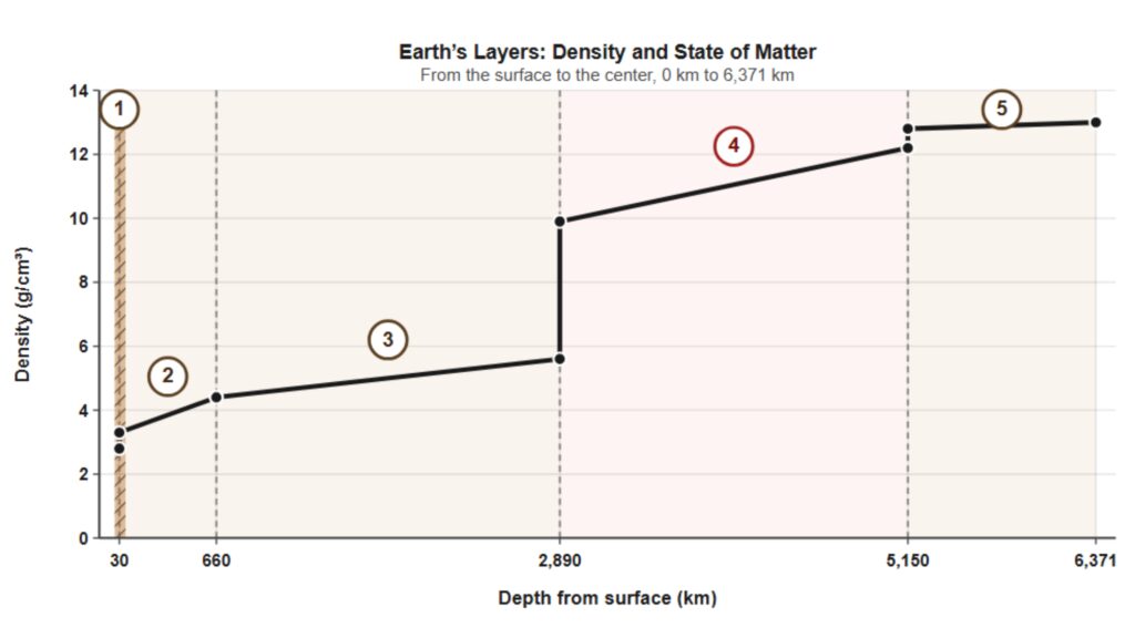
Density of Earth’s Layers
(BETA TESTING)
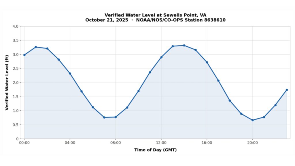
Tides at Sewells Point
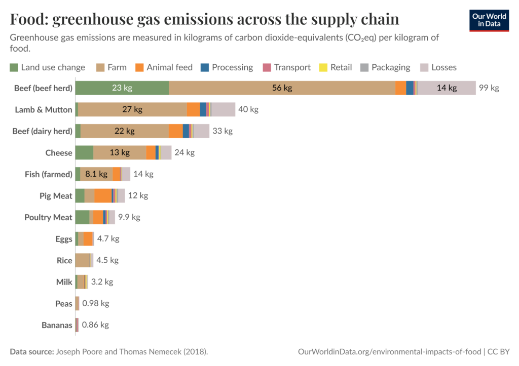
Greenhouse Gas Emissions in Food Production
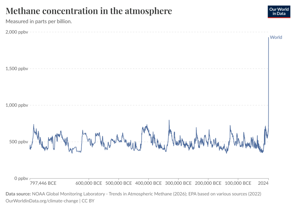
Methane Concentration in the Atmosphere
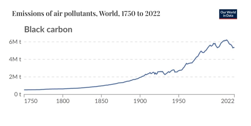
Black Carbon
Emissions
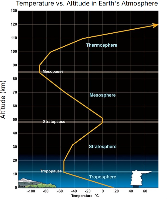
Temperature vs Altitude
in Earth’s Atmosphere
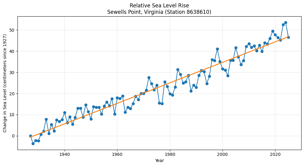
Relative Sea Level Rise
Sewells Point, Virginia
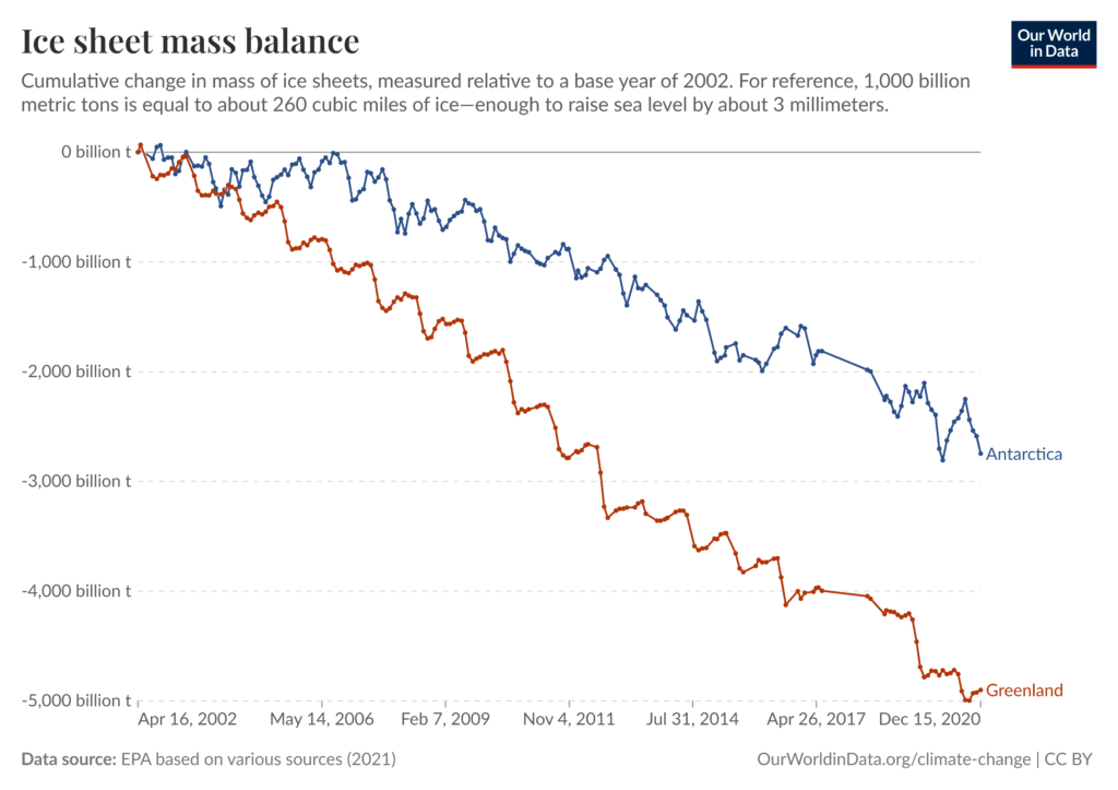
Antarctica and Greenland Ice Sheet Mass Balance
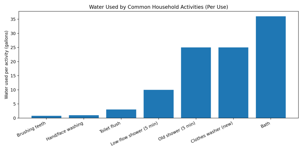
Water Used by Common Activities
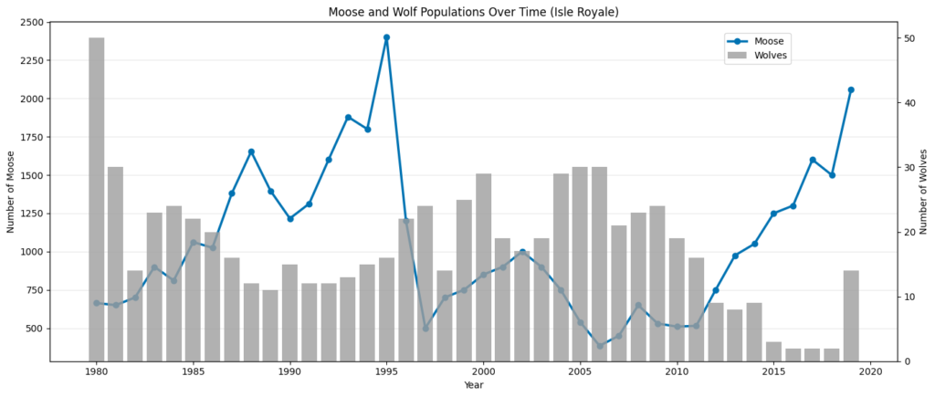
Moose and Wolf Populations
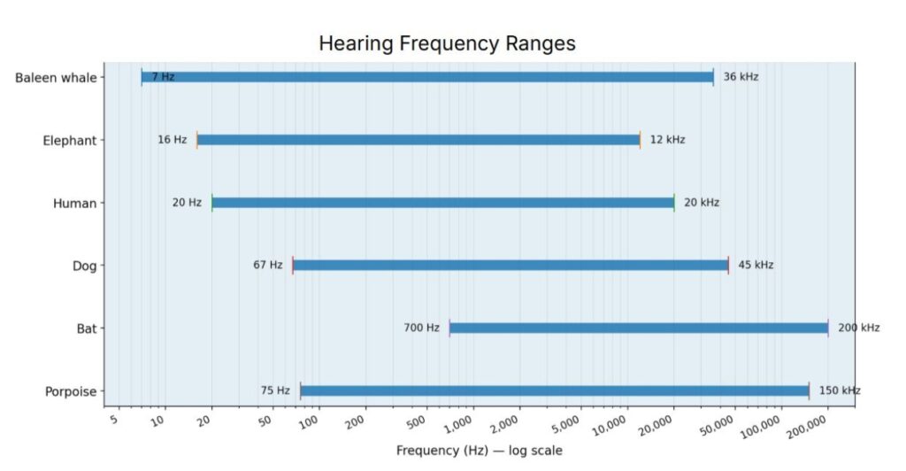
Hearing Frequency Ranges
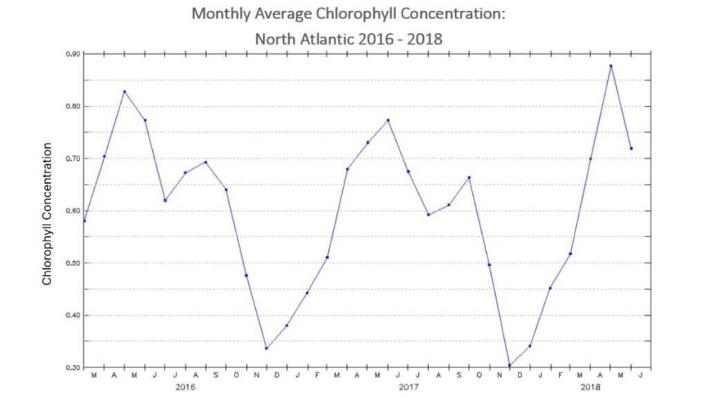
North Atlantic Chlorophyll Concentration
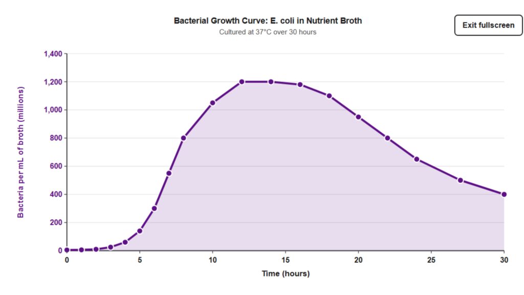
Bacteria Growth
(BETA TESTING!)
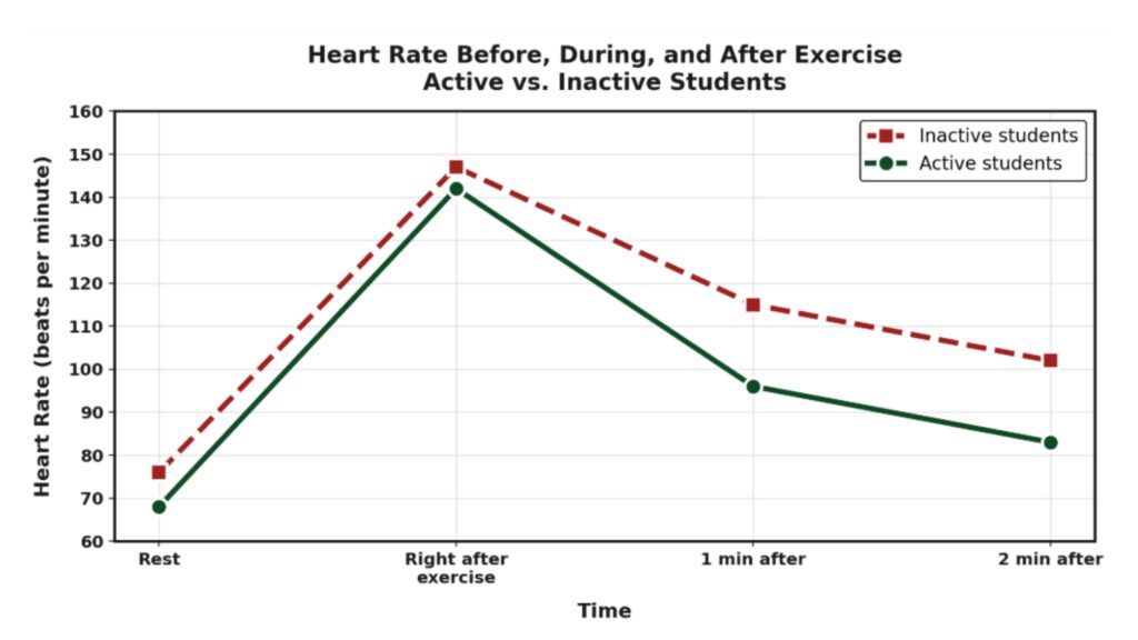
Heart Rate Comparison
(BETA TESTING!)
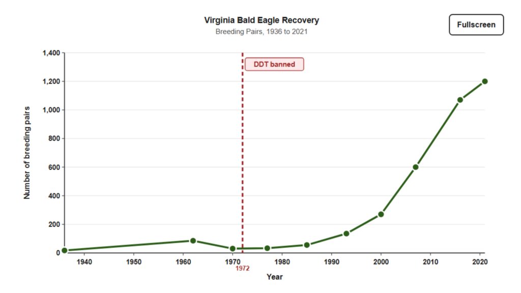
Bald Eagle Recovery
(BETA TESTING!)
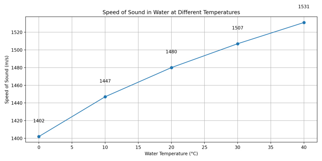
Speed of Sound in Water
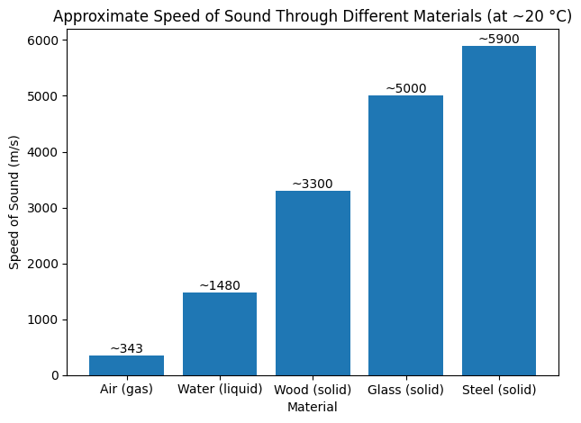
Speed of Sound in Different Materials
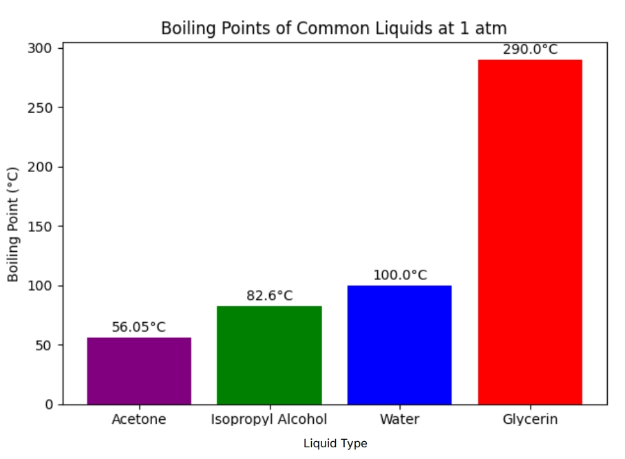
Boiling Points of Common Liquids
Hearing Frequency Ranges
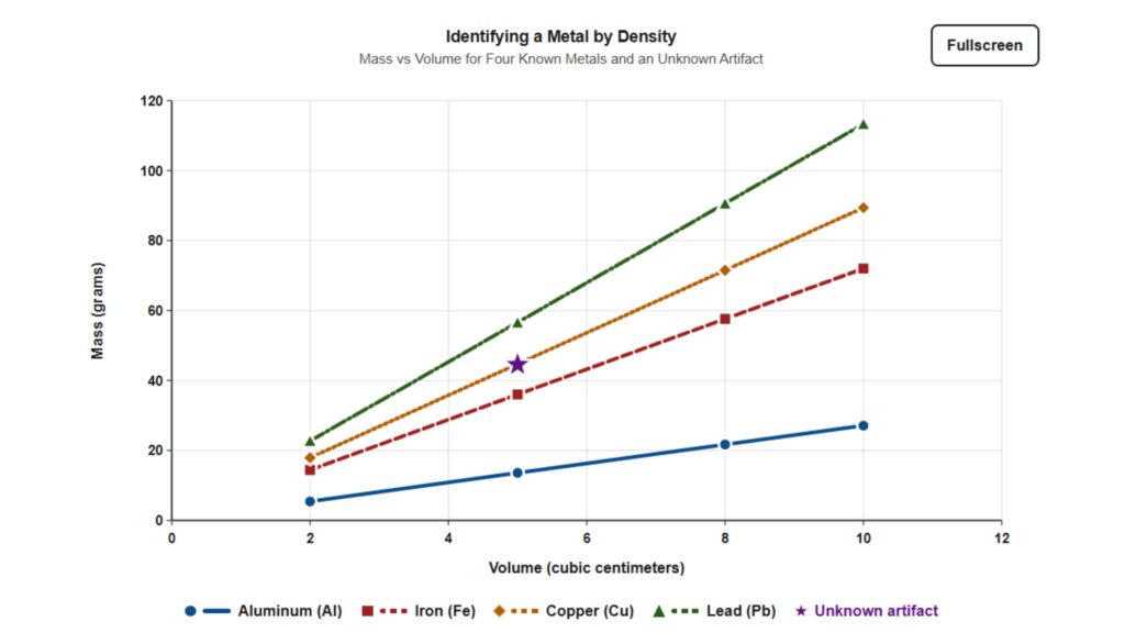
Density of Metals
(BETA TESTING!)
Whole or part of this STEM programming was made possible by the Virginia General Assembly
for COVA STEM Hub for regional activities and programming.
