Virtual Science Teachers offers a growing collection of graphing and data analysis resources designed to help students build essential scientific literacy skills. These resources support students in reading, interpreting, and analyzing data, while giving teachers flexible tools they can use as bell ringers, discussion starters, practice activities, or assessments.
All resources are free, interactive, and aligned to classroom instruction- whether students are just learning how to read a graph or practicing deeper data-based reasoning.
Graph
Makers
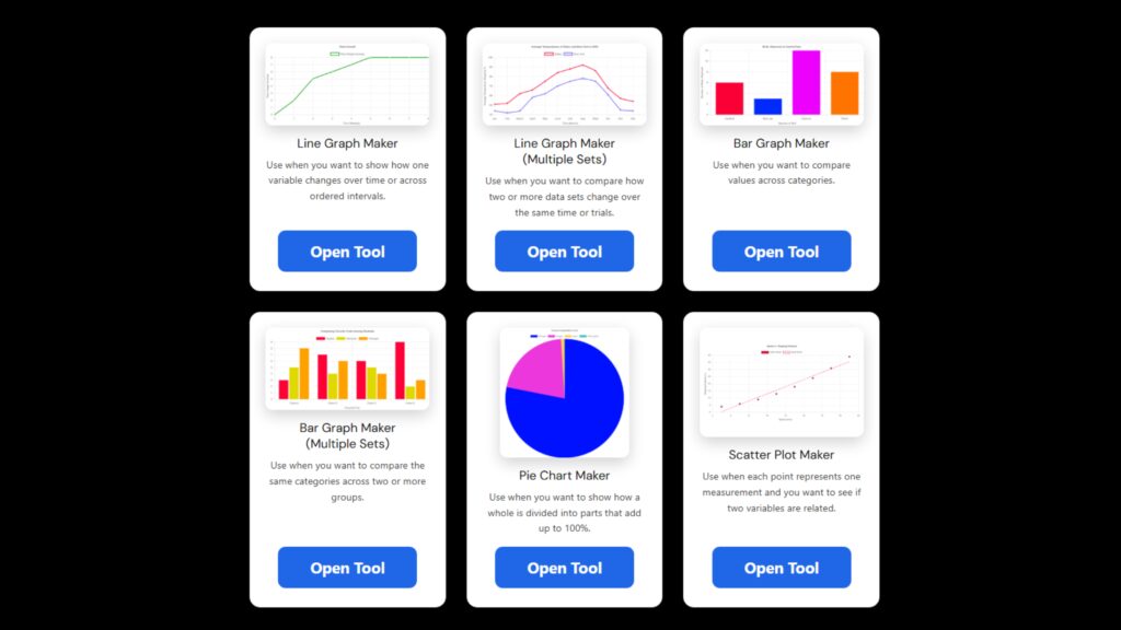
Easy-to-use Graph Maker Tools help students create graphs using six graph types to visualize data and support scientific explanations.
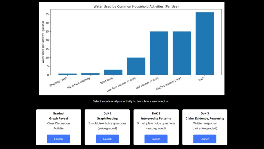
NEW! Science Data Analysis Progression activities include a gradual graph reveal, scaffolded multiple-choice questions, and a CER activity for each graph.
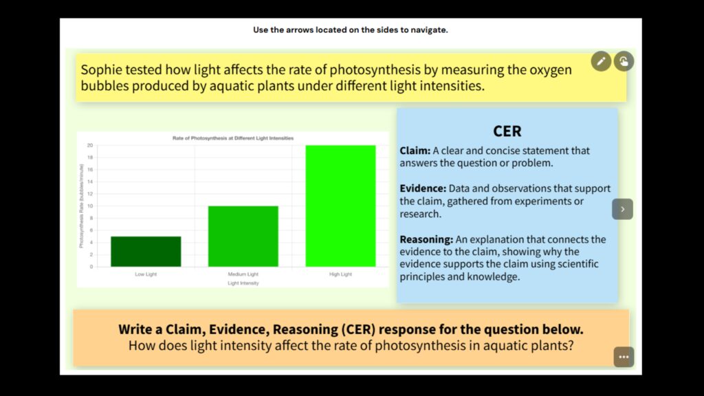
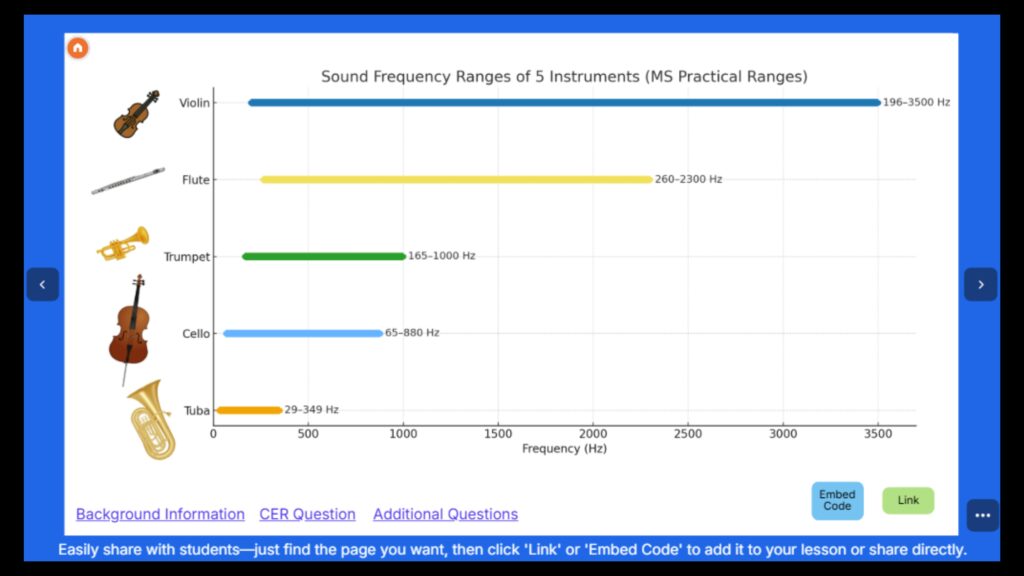
A collection of science graphs based on real science data designed to spark discussion and build data analysis skills. Includes CER & additional questions.