Background Information
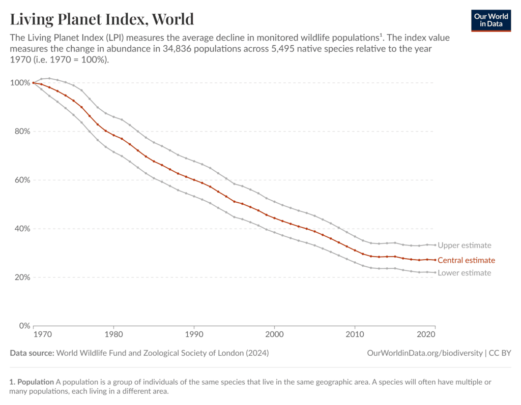
The Living Planet Index (LPI) is a way scientists track how wildlife populations change over time. It combines data from many animal populations around the world. In this graph, the year 1970 is used as a starting point and is set to 100%, so later years can be compared to that baseline.
Wildlife populations change when factors in their environment change. Animals need food, water, space, and suitable habitats to survive and reproduce. When these needs are not met, populations can decrease.
Several factors can cause wildlife populations to decline over time, including:
Habitat loss, such as forests being cleared or wetlands being drained
Pollution, which can harm animals directly or damage their food sources
Overuse of natural resources, such as overfishing or hunting
Invasive species, which can compete with native species for food or space
Changes in environmental conditions, which can affect where animals can live and raise their young
Because the Living Planet Index combines data from many species, the pattern in the graph shows an overall global trend, even though individual species may change at different rates.
Scientists use long-term graphs like this to understand how multiple factors can affect wildlife populations over many decades, not just from year to year.
CER Question
What overall pattern does the Living Planet Index show about global wildlife populations from 1970 to 2020?
Claim
Make a claim describing how global wildlife populations have changed over time compared to 1970.
Evidence
Use specific data from the graph to support your claim.
Include:
Approximate years
Approximate index values (percent compared to 1970)
Reasoning
Explain why wildlife populations around the world might change in this way over time. In your explanation:
Connect the trend to factors that can affect populations, such as habitat loss, pollution, overuse of resources (overfishing/hunting), invasive species, and changes in environmental conditions
Explain how these factors can reduce survival or reproduction, which causes populations to shrink
Remember: the index combines many species, so the pattern shows an overall global trend
Additional Questions
In 1966, about how far north was the average winter location of birds, according to the graph?
By 2013, approximately how many miles north had the average winter location of birds shifted?
Does the graph show the average winter location of birds generally increasing, decreasing, or staying the same over time? Explain your answer using the line on the graph.
Are there any years where the average winter location moves slightly south instead of north? What does this tell you about changes over time?
Based on the pattern shown, what is one environmental condition that could influence where birds spend the winter?
Embed This Graph of the Week
Copy and paste this code into your LMS or website (Canvas, Google Sites, etc.).