Source: U.S. Environmental Protection Agency (EPA). Climate Change Indicators: Bird Wintering Ranges. Archived January 19, 2017. Data from long-term bird monitoring studies (1966–2013). Graph adapted for educational use.
Background Information
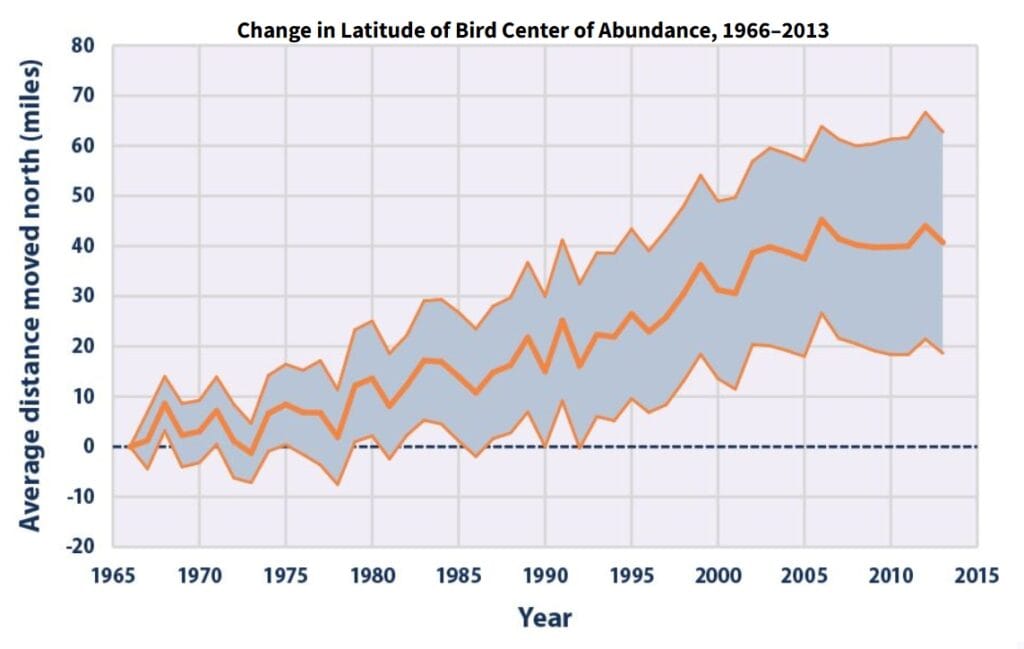
Birds depend on environmental conditions such as temperature, food availability, and habitat to survive during the winter. Over long periods of time, changes in these conditions can affect where birds spend the winter.
This graph shows how the average winter location of many bird species has changed from 1966 to 2013. The line on the graph represents the average movement north for all the bird species included in the study.
The gray shaded area around the line shows that not all bird species changed in the exact same way. Some species shifted farther north, while others shifted less. The shaded area represents the range of differences among species, while the line shows the overall average trend.
Scientists use graphs like this to understand patterns over time, even when individual species behave a little differently.
CER Question
What overall pattern does the graph show about where birds spend the winter from 1966 to 2013?
Claim
Make a claim describing how the average winter location of birds has changed over time.
Evidence
Use specific information from the graph to support your claim.
Include:
Approximate years
Approximate distances birds moved north (in miles)
Reasoning
Explain why this pattern makes sense.
In your explanation:
Describe what it means for the wintering range of birds to shift north
Connect changes in bird locations to changes in environmental conditions
Additional Questions
In 1966, about how far north was the average winter location of birds, according to the graph?
By 2013, approximately how many miles north had the average winter location of birds shifted?
Does the graph show the average winter location of birds generally increasing, decreasing, or staying the same over time? Explain your answer using the line on the graph.
Are there any years where the average winter location moves slightly south instead of north? What does this tell you about changes over time?
Based on the pattern shown, what is one environmental condition that could influence where birds spend the winter?
Embed This Graph of the Week
Copy and paste this code into your LMS or website (Canvas, Google Sites, etc.).